All designers have opinions on the best and worst fonts; especially on which are worst. So much so, it seems everywhere you look these days someone has written them down and shared them in a blog post. Well, this post is no different. We simply felt it was time to share our judgement in this worldwide dialogue. Our list counts down from number ten to the number one World’s Most Tragic Font.

10. Arial
The origin of Arial is commonly misunderstood. While Microsoft introduced it into their suite of system fonts for Windows 3.1 it was actually created for IBM. It is true that Microsoft intended Arial to be the competitor for Helvetica, however it was not designed to copy it. Arial was in fact based on the Monotype Grotesque typeface, a design from the late nineteenth century.
Regardless of whether it was designed to copy Helvetica, it is a copy-cat. The world of designers see it this way and use of this font in a design automatically invalidates the work in their eyes. It is a font better used for documents and blogs and left out of creative designs.

Helvetica Vs. Arial by Harajukumatt

9. Impact
Impact was designed in 1965 by Geoffrey Lee for the Stephenson Blake Foundry. It was originally intended for use in newspapers as headlines and in advertisements. However, its large x-height causes all the letters to appear as capitals creating a readability issue; this coupled with the short ascenders and descenders results in the font appearing too condensed for easy legibility. The letters are squished and do NOT make for good headlines. The fact that it has become the favorite font for internet memes does not help its status as an abhorrent choice of typeface either. Any design featuring Impact is automatically deemed amateurish and lowbrow.

Meme making fun of Impact

8. Marker Felt
Designed in the early 1990’s by Pat Snyder, an art teacher and son of a sign painter, this whimsical font is one of many that have made the list due to its overuse in inappropriate situations. It seems its position as the default font for Apple’s iOS Notes app has caused people to identify it as a suitable casual business font. Corporate Power Point presentations and business cards are not appropriate outlets for a design mimicking a magic marker.

Marker Felt in presentation and iOS Notes
*Keynote slide taken from www.yourdonreport.com.

7. Trajan
Trajan was released in 1989 by Carol Twombly who drew inspiration from the Roman typography found on Trajan’s column in Rome. Overall there is nothing wrong with the design, but its overuse in movie posters has made this one of those used and abused fonts that no one wants to see anymore.

Movie posters with Trajan, none of which are Roman themed

6. Vivaldi
Designed by Friedrich Peter in 1994, this typeface features intricate initial caps combined with reserved lowercases to create an elegant script. However, its overuse in wedding invitation designs has pushed it into permanent association with white taffeta, pink hearts, and tiered cakes. If you’ve ever opened an invitation to a wedding and had a hard time focusing on the words within all the loops, swirls, and arabesques, you understand why it is not practical for everyday use. In short, it is difficult to read (though beautiful) and it overly formalizes a design.

Typical wedding invite featuring Vivaldi

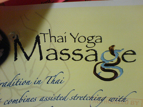
5. Brush Script
Robert E. Smith designed Brush Script in 1942 for the American Type Founders. It’s handwritten style makes it a more casual script, but since people rarely write in this form of cursive style anymore, it simply looks dated. Unless you’re looking for that unattractive-retro-car-ad look from the 1970’s, this font is better left alone.

Florida Parks postcard with Brush Script

4. Curlz MT
We have Carl Crossgrove and Steve Metteson to thank for giving us Curlz MT in 1995. In order to understand why Curlz has received a top ranking spot on this list one merely needs to look at it.

Go ahead, look at it… Enough said!

3. Hobo
Hobo, designed by Morris Fuller Benton and released in 1910, is yet another typeface to make the list due to overuse and abuse. When seen on its own, it is not an unattractive design, just a bit offbeat. Every stroke is curved and it has no descenders which make it just slightly jarring to the eye. For example, take a look at the lowercase ‘g,’ and it is easy to see the design flaw that makes this font impractical. At first glance it appears to be a backwards uppercase ‘Q’ or a lowercase ‘g’ with half its tail cut-off. Any font with letters causing readers to stop and discern the letters present produces poor readability. Rarely is there an occasion appropriate for its use, and it’s been so often unfittingly used that we’d rather not see it. Ever.

Hobo type specimen – note the lower case ‘g’
*Image from hatehobo.tumblr.com.

2. Comic Sans
Vincent Connare is to blame for the world’s introduction to this oh-so-hated font in 1994. Comic Sans was Connare’s solution for creating a digital text for comic book dialogue bubbles. This was and is the only suitable use for this font.
However, since its inception, this font has made its way into too many child birthday party invitations, garage sale flyers, menus, car wash posters, the list goes on and on, for it to be taken seriously. It is a specific design for a specific purpose. Unless you are designing a comic book do NOT use!

A wonderfully childish use of Comic Sans

1. Papyrus
Papyrus is our number one most tragic typeface for good reason. It is the most tragically overused and abused typeface in existence.
In 1983, Chris Costello, a designer and calligrapher, spent six painstaking months designing this font by drafting it over textured paper with a calligraphy pen. It is intended to represent Costello’s idea of what the English language would have looked like written on papyrus paper 2000 years ago. The truth is, it is a unique and creative design, we’ve just seen too much of it.
Every company who feels their services or products serve up an ethnic flare selects Papyrus for their font. However, it doesn’t stop there. Plenty of businesses having nothing to do with European or International products abuse this typeface as well. So, we’d like to use this as an opportunity to clear something up:
Using Papyrus is NOT creative! It does NOT make your design look exotic! Please DO NOT USE PAPYRUS!
It is sad that Costello’s efforts to create such a distinct font have been dashed as his typeface has become clichéd and unoriginal. While it holds the number one spot on this list, its popularity must attest to the success of his design, and though we hate it now it is due to user abuse, not a flawed design.
Well, there you have it. We’ve said our piece, shared our views, and made our position known. We hope you keep an eye out for our next Typographical blog: “The Top Ten Sexy Typefaces.”
Most historical information about the fonts discussed came from these sources:
Thank you for putting my thoughts into words!!!
You are very welcome Yvonne!
Ms. RIta:
Please consider sharing alternatives to these widely popular fonts unless you’re just venting.
Respectfully,
Mitchell
Hi Mitchell,
Thank you for your feedback. You’re absolutely correct in pointing out we shouldn’t complain without offering an alternative. We’ve written on a wide array of typographical topics, and while we used this particular post to advise against these types, please refer to some of our other blogs: http://www.treefrogcx.com/2014/02/11/top-ten-sexy-typefaces/ and http://www.treefrogcx.com/2014/09/26/5-free-spooky-fonts-for-your-halloween-design/ where we offer positives and advice on fonts for design.
Very Respectfully,
Rita
As a comic book letterer, let me say that Comic Sans is never an appropriate choice for lettering comic books. It reads so poorly and is the mark of someone with no idea what they’re doing.