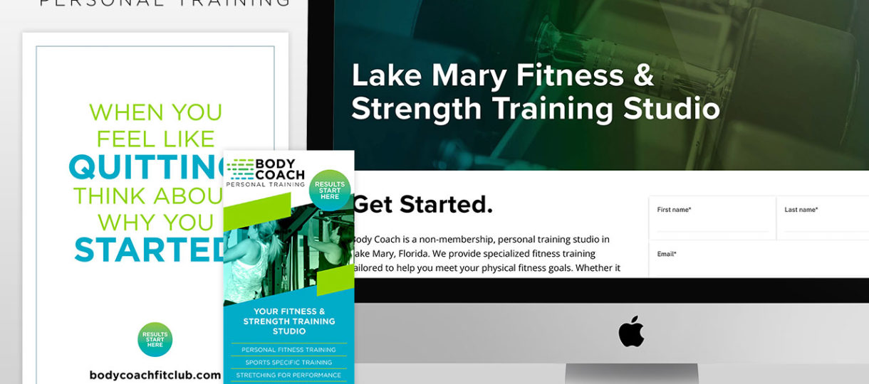
Body Coach is a fitness training gym that appeals to those looking for a one-on-one training experience. The old brand featured a masculine figure in tired drab colors. The Treefrog team gave the brand a refresh with an invigorating color palette. The lime green signifies growth as the fresh blue is meant to electrify and excite. The rollout for the brand can be seen throughout the gym with the logo installation we designed, business cards, rack cards, wall art, and posters. The new website was built on the Squarespace platform and, with our digital marketing and social media campaign, has…
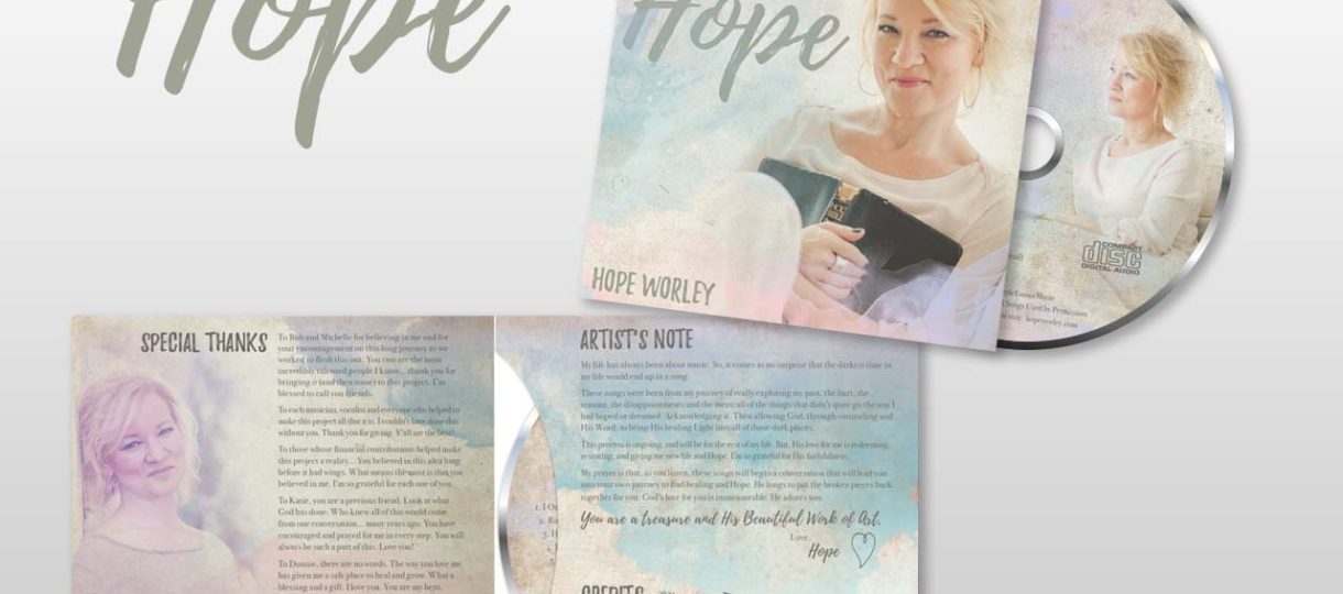
Hope Worley approached the Treefrog team needing marketing guidance and design for her musical album debut. To facilitate this pivotal moment for Hope's singing career, the Treefrog team designed a beautiful album cover, art, and layout, an album release party invitation, a countdown campaign on social media, and Bandcamp graphics for online sales. View on Bandcamp
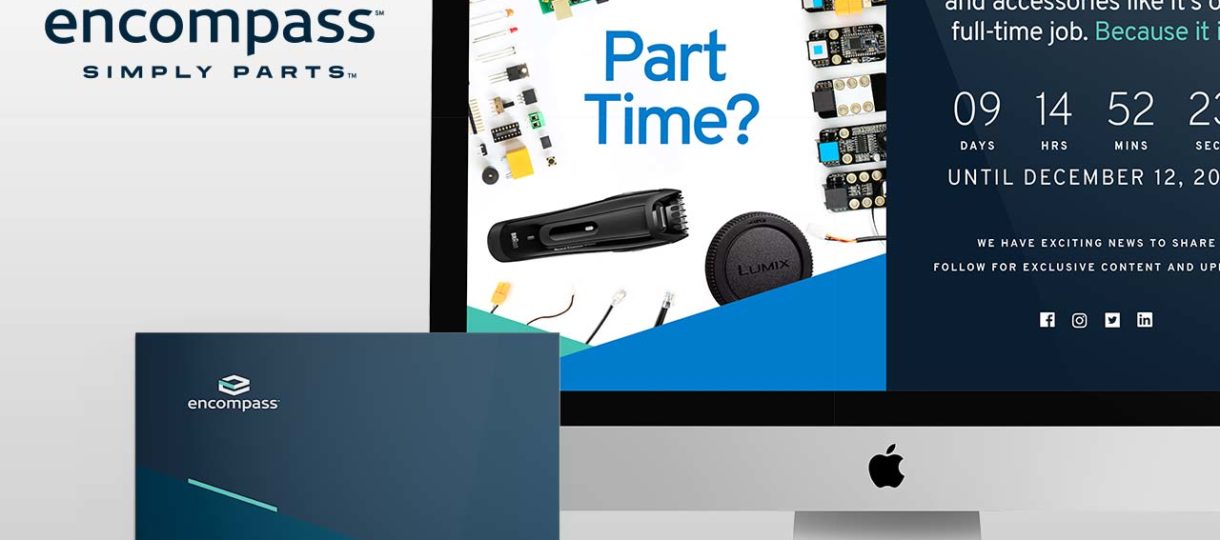
In 2018, Encompass Supply Chains Solutions reached out to the Treefrog Team to tackle a full rebrand to better align with the company’s current positioning and core competencies. With one of the country’s largest, most diverse parts inventories in the country, along with a wide array of logistics services, the company name was kept, maintaining its 'all-encompassing' solution to the market. The new brand design comprises the wordmark Encompass in dark blue, lower case text, reflecting both strength and friendliness. An 'eHex' symbol above the brand is derived from the form of how parts are received: a shipping box. It…
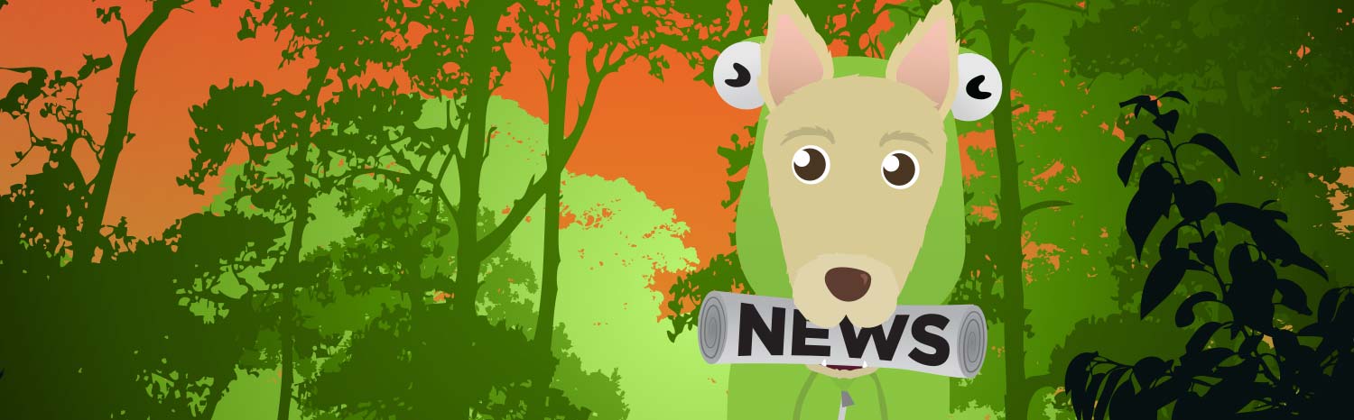
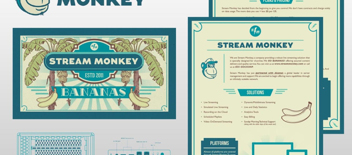
Stream Monkey provides video streaming service for many companies and churches across the country. They have a stellar brand and came to us need some brand collateral, tradeshow marketing materials and illustrated diagrams for client manuals. We created a fun background with banana trees for a tradeshow video as well as a flyer used to market their business while at the tradeshow. Next, we were tasked with creating a desktop background with two banana icons (we nicknamed bananacons) that their clients use to start and stop their video stream. We also had the opportunity to create several technical diagrams that…
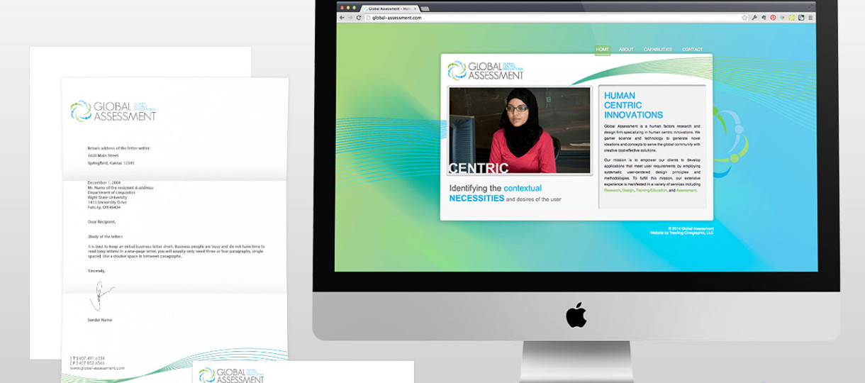
Shatha Samman started her business to help companies learn how to create user interfaces that work from a global perspective. We were tasked with creating a brand that encompassed the idea of human centric innovations. We used a cool color palette and a series of interlocking human figures to create the logo icon and a clean sans-serif typeface to communicate a modern, forward thinking message. We also designed collateral incorporating a series of lines in the shape of a wave to continue the forward thinking idea. The business cards are printed on a frosted transparent plastic and the microsite is…